Create an App Logo Without Design Skills Using Claude's SVG Artifacts
, edited: , Version History · 4 min read
I have created a good enough looking logo for my weekend project in minutes without any design skills or expensive software using Claude’s SVG artifact feature.
As an Site Reliability and Platform Engineer, I appreciate visually pleasing designs but lack both the skills to create them and the interest in learning design software. So why not ask the mighty AI to help with creating app icon? Claude’s Artifacts feature can preview SVGs directly, making it a good tool for an iterative, exploratory approach to design. Initially skeptical about the quality I could achieve, I was pleasantly surprised by the results — more than adequate for my weekend project.
The Process 🔗
My project was a GTK4/Adwaita (the native UI toolkit) application for the GNOME desktop environment. To ensure design consistency, I turned to GNOME’s Human Interface Guidelines (HIG), which outline how applications should look and behave, including specifications for app icons.
I concatinated all the HIG’s restructured text files into a single document and provided this as context for Claude. In retrospect, just the icon guidelines page would probably have been sufficient. My initial prompt included the entire HIG along with details about my application’s name and purpose, asking for an icon that would fit the GNOME desktop aesthetics.
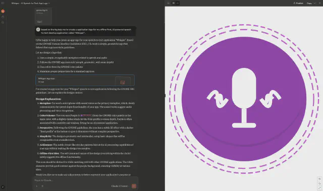
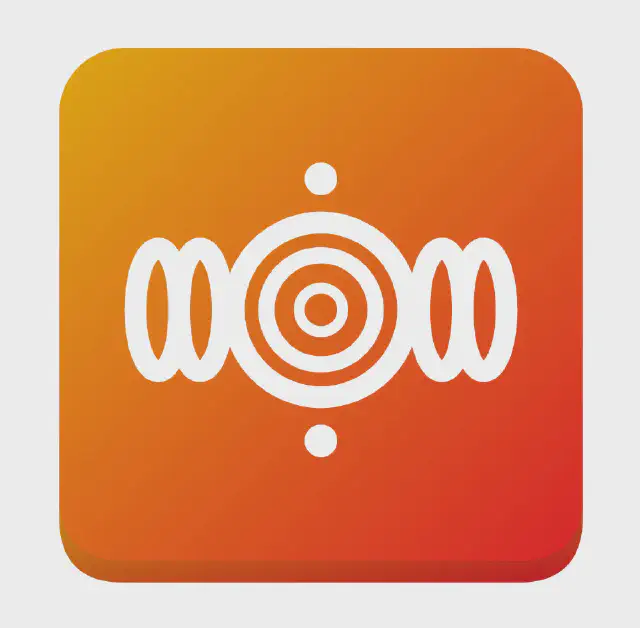
Well, not really what I expected, but to be fair, I didn’t give it much direction. So let’s iterate and give the AI more to work with by describing a sound wave concept I had in mind.
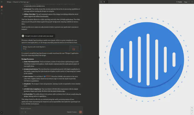
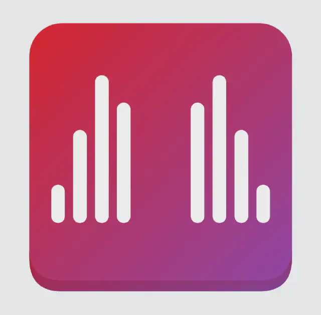
More like it, but still kind of janky. The vertical bars are too thin, not centered, and I wasn’t sure about the purpose of the random dotted circle. I asked Claude to refine these specific elements in my next prompt.
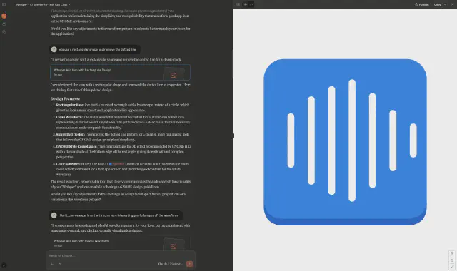
Now, the third try did surprise me because it looked acceptable for the first time.
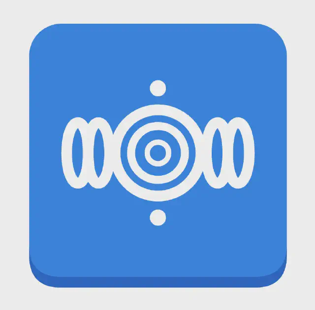
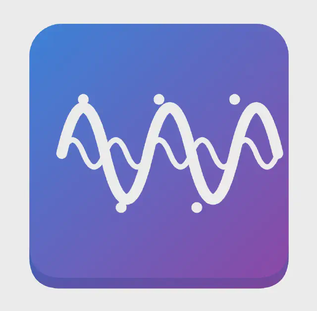
This design looked more like app icons I was already familiar with in the GNOME ecosystem. While the audio wave still looked odd, the overall direction was promising. I experimented with various colors and sound wave design, requesting different versions with specific changes each time. None of the versions were perfect, but two stood out: one featuring an appealing gradient (3) and another with better vertical bars (2).
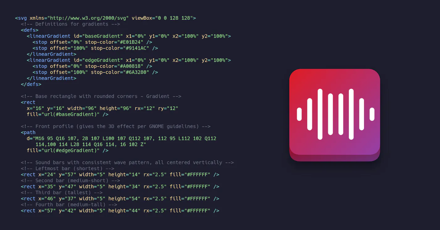
I could have tried to merge these two versions via AI, but it seemed easier to combine them manually. I pasted the version with the nice gradient (3) into an SVG Viewer and removed the old sound wave elements. After that, I copied the good vertical bars from version 2 and inserted them into the gradient background.
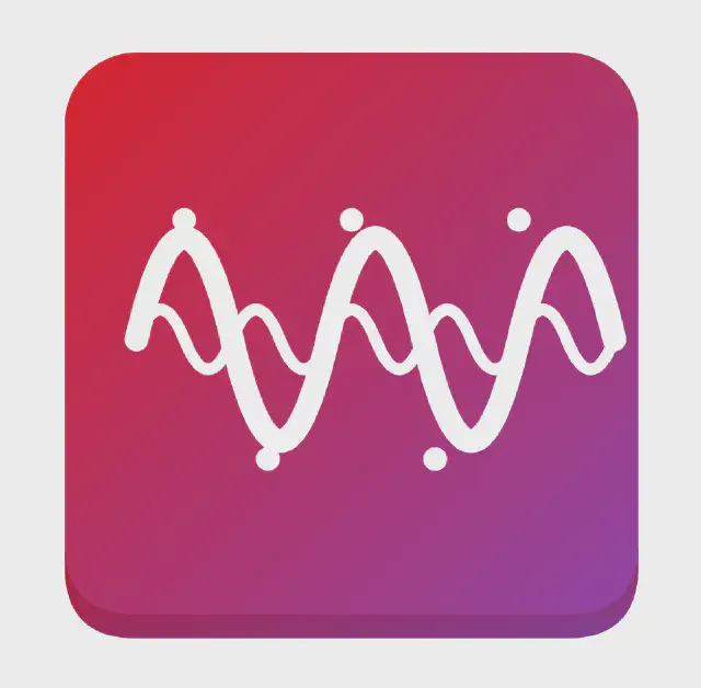
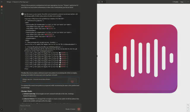
After I had only the elements I liked, I needed to reorder them and center the waveform properly. This would probably be easy to do manually in Inkscape, but I was curious if Claude would be able to complete this task. I provided the merged SVG and asked specifically to reorder the bars to form a centered waveform. To my surprise, it worked rather well.
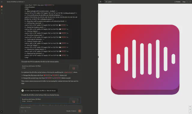
There was just one last thing that bothered me. The 3D effect at the bottom was difficult to see against the background. So I asked Claude to make it thicker and darker, and it implemented this change flawlessly.
Results and Reflections 🔗
Within a few minutes, I got an app logo that I am pretty happy with. Sure, is it the best and most recognizable logo? No. Could a professional designer do it better and faster? Probably. But for people like me, who work alone on their weekend projects and don’t have the necessary design skill set, this approach can save time and prevent frustration. The total time invested was about 10-20 minutes of back-and-forth with Claude, plus a few minutes of manual editing.
So what are my learnings from this project?
- Keep your requests simple and focused on small, incremental improvements.
- Use existing design guidelines and examples as context for the AI.
- Do not expect the first version to be perfect - plan for multiple iterations.
- If the AI fails to get certain elements right, don’t be afraid to fix things manually.
- Don’t waste your time trying to force the AI to create the perfect result.
- Use intermediate results as a new base/context for further refinement.
I would definitely recommend experimenting with this approach for small/simple personal projects.
